
The Rise of Political Polarization and Partisanship in the U.S.
Nowadays it seems as though politics in the United States are more polarized than ever. To many, the Democrats have moved further to the left, and the Republicans further to the right, with both Congress and the American people becoming ever more divided.
But how accurate is this conception? How severe is the recent rise of political polarization and partisanship in the United States? How recent is this trend? What are its causes? With graphs, statistics, and an in-depth look at American politics over the past fifty years, we hope to answer these questions.
Section 1: Congress
First of all, it’s necessary to quantify the polarization of Congress over time. Though it’s difficult to measure the extent to which a government official is “liberal” or “conversative”, one such widely used measure is the Poole-Rosenthal DW-NOMINATE scores. Under their liberal-conservative axis, a high negative score indicates a highly liberal Congress member, a high positive score indicates highly conservative, and a score close to 0 indicates moderate. The range of the scores is from -1 to 1. It’s a very complex system, but in simple terms, the NOMINATE test uses the roll call voting history of government officials to give them a score. In this article, only 1 dimension of Poole and Roosenthal’s ideological scores will be used, the “liberal-conservative” axis, but their system uses over 10 dimensions and concludes that a 2-dimensional model is the best fit. It is entirely possible that a more detailed look at the data would reveal the story is more complicated.
The ideological gap between Republicans and Democrats in Congress has increased considerably since the 1970s. In this graph from the American Political Science Association (APSA), the y-axis shows the difference in mean positions between the two parties in both the House of Representatives and Senate from 1878 to 2011, using the DW-NOMINATE measures.
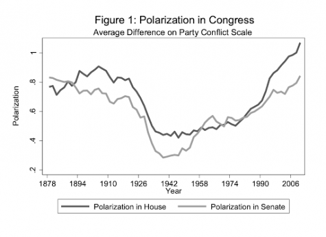
As you can see, Congress is more polarized than it has been in over 125 years. It should also be remembered that this data is only available up to 2011, and the current Congress, empirically speaking, seems even more divided.
So, who is responsible for this growing gap in Congress? Have Republican congressmen become more conservative, or have Democrat congressmen become more liberal? In this second graph by the APSA, you can see the average ideological scores of Republicans and Democrats in the House and Senate over time.
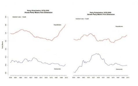
Since 1945, both Republican congressmen have become more conservative, and Democrat congressmen have become more liberal, using the DW-NOMINATE testing system.
But how has cooperation between Republican congressmen and Democrat congressmen changed over time? One would think that this increased ideological divide would make cooperation more difficult, and that’s exactly what happened. Since 1977, congressmen of different parties have become less and less likely to agree with each other on a roll call vote (congressional vote), and more likely to agree with congressmen of the same party. In these graphs by the Public Library of Science (PLOS), there are probability density functions of the number of vote agreements between congressmen of the same party and congressmen of cross parties. The plots show the steady divergence of same-party and cross-party agreement rates over time. Above each distribution is the Congress number (81–112), followed by the year the Congress commenced, and the number of total votes during the two sessions of each Congress.
Probability density functions of same-party and cross-party pairs over time
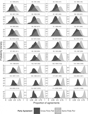
From 1949 to 1979, congressmen of differing political parties would frequently agree in votes. An agreement between congressmen of the same party was almost as likely as an agreement between congressmen of the different parties. But starting in 1981, these cross-party agreements became rarer and rarer, with same-party agreements becoming more common. The most recent Congresses exhibit barely any cross-party agreements, but same-party agreements are extremely frequent.
Another way to visualize this decreasing cooperation between parties in Congress is with plots. In this second graph by PLOS, each member of the U.S. House of Representatives from 1949–2012 is drawn as a single node. Republican (R) representatives are in red and Democrat (D) representatives are in blue. Edges are drawn between members who agree above the Congress’ threshold value of votes.* Each node is sized relative to its total number of connections; edges are thicker if the pair agrees on more votes. If a pair is between two Democrats, then the edge is blue. If it is between two Republicans, then the edge is red. If it is between a Republican and a Democrat, then it is black. The starting year of each two-year Congress is written above the network.
Division of Democrat and Republican Party members over time
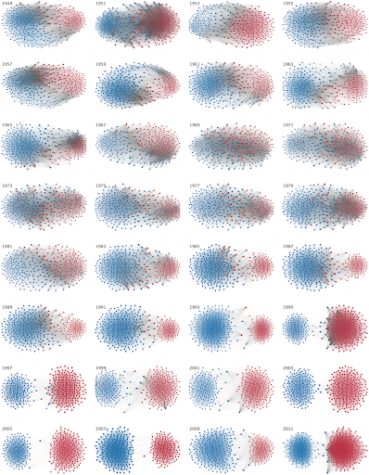
*The threshold value is the number of agreements where any pair exhibiting this number of agreements is equally likely to consist of two members of the same party (e.g. D-D or R-R), or a cross-party pair (e.g. D-R).
Overall, the amount of agreements between Representatives of different political parties has been decreasing since 1980. These cross-party agreements used to be extremely common, but now they are almost nonexistent. Instead, agreements occur nearly entirely between Representatives of the same party. What this means is that along with an increase in political polarization between Democrats and Republicans in Congress, there has also been an increase in partisanship in Congress.
Section 2: The American people
But what about the American people themselves? Has there also been an increase in political polarization and partisanship in the populace? One great organization for surveying social trends in the U.S. is the Pew Research Center, a nonpartisan American think tank based in Washington, D.C. Pew Research uses an “Ideological Consistency Scale” to gauge the extent to which people offer mostly liberal or mostly conservative views across a range of political value dimensions. It uses 10 questions, with a positive score being more conservative, and a negative score being more liberal.
First off, there is now a lower percentage of Americans with a mix of conservative and liberal positions than in the past. Since 1994, more and more Americans have moved to the left or right. Here is a graph by a 2017 Pew Research study showing the distribution of the American public on the previously mentioned 10-item scale of political values.
Distribution of the American Public on a 10-item scale of political values
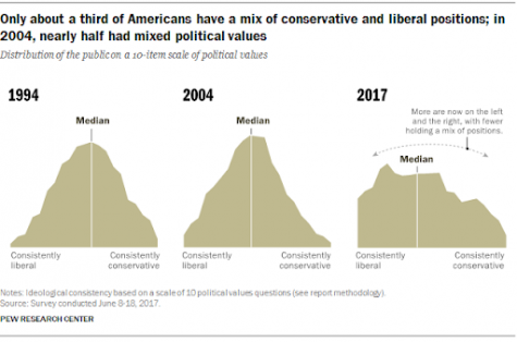
In 2004, nearly half of Americans had a mix of conservative and liberal positions. By 2017, that number dropped down to a third of Americans. This means that the number of moderates has been decreasing.
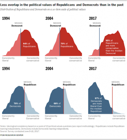
There is also less overlap in the political values of Republicans and Democrats than in the past. Since 1994, a higher percentage of Republicans have become more conservative than the median Democrat, and a higher percentage of Democrats have become more liberal than the median Republican. Here is another political value distribution scale of the American people by Pew Research.
Distribution of the American Public on a 10-item scale of political values
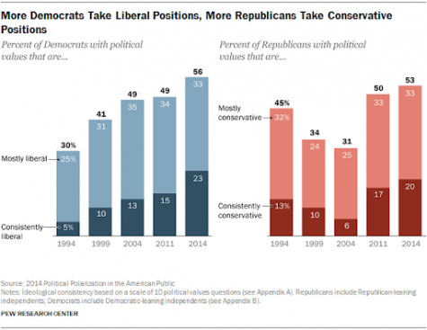
Are Democrats or Republicans more to blame for political polarization? Well, both are. Since 1994, the percent of Democrats with political values that are consistently liberal have been increasing, and since 2004, the percent of Republicans with political values that are consistently conservative have been increasing. The following is a graph by a 2014 Pew Research study, so it does not contain data from the past seven years, but still displays the trend that we are experiencing today.
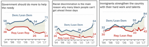
So what issues are causing this greater division? The largest issues separating Democrats and Republicans are their opinions on: how much the government should do to help the needy, the presence of racial discrimination, and immigration. The following is data from a 2017 Pew Research study.
Percent who say…
There is also the large debate over diplomacy versus military strength. Democrats increasingly say peace is ensured by good diplomacy, while Republicans say it is military strength that ensures peace. In 2017, 83% of Democrats saw good diplomacy as the way to ensure peace, compared with 33% of Republicans.
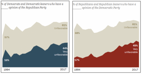
The views that Democrats and Republicans hold towards each other have also gotten worse in recent years. The percentage of Democrats and Republicans with a negative and very negative view of the opposing party has risen drastically since 1994. In this graph from a 2017 Pew Research study, the opinions of Democrats and Republicans of the opposing party is shown.
Rising tide of partisan antipathy
The increased ideological gap between Democrats and Republicans has grown to be much larger than the differences between the opinions of men and women, Black and white, young and old, religious and non-religious, etc. The following is a graph by Pew Research showing the percent difference across the 10 political values the organization has tracked since 1994, between different societal groups.
Percent difference across 10 political values between societal groups, over time
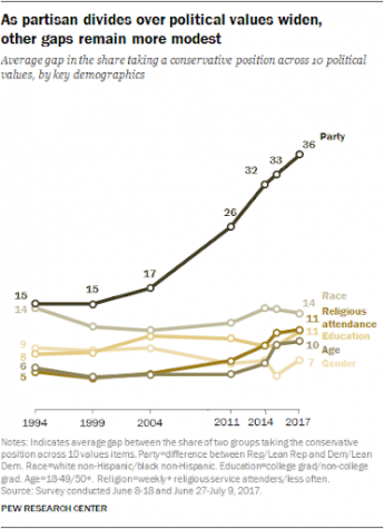
Party = Democrats / Republicans
Race = Whites / Blacks
Education = College grad / Non-college grad
Age = 18-49 / 50+
Religion = Religious service attenders / Do not attend religious services
Gender = Men / Women
As you can see, party orientation has become the biggest divider in political values in the U.S., and by a large margin. There is now an average 36% point gap between Republicans and Democrats, but in 1994 it was only 15%. The next largest divider in political values, race, is only a 14% difference.
Section 3: Why did this happen?
Looking at the trend of rising political polarization in the U.S. since the 1970s, both in Congress and amongst the American people, the first question that comes to mind is the cause of this trend.
One possible reason is the rise in income inequality that’s been occurring since 1969. When income inequality and political polarization in the House of Representatives are put next to each other over time on a graph, there appears to be a correlation. In this graph by the American Political Science Association, the y-axis shows the difference in median scores for the two parties in the House of Representatives from the previously mentioned DW-NOMINATE test (left hand side), as well as the Gini coefficient in the United States (right hand side). The Gini coefficient is a measure of income inequality that ranges between 0 (perfect income equality) and 1 (one person controls 100% of the nation’s income).
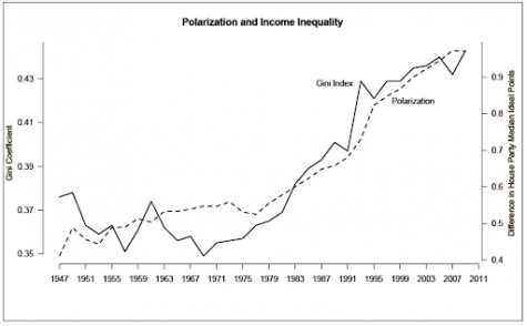
The inequality theory can explain the decline of polarization during the first half of the 20th century, as economic inequality fell dramatically in that period. That being said, the way in which income inequality would affect political polarization isn’t entirely clear, and it is also possible that this a correlation, not causation, relationship. That would mean that there’s another, different factor that affects both income inequality and political polarization, causing the two to be correlated but still independent of each other, rather than directly influential of each other.
Another possible reason is the change in media that’s occurred since 1987. The Fairness Doctrine of the Federal Communications Commission (FCC), introduced in 1949, was a policy that required media companies to present important issues in contrasting views. This essentially meant when a controversial issue was being discussed, both the liberal and conservative sides had to be presented by the media company. In 1987, the Fairness Doctrine was repealed, allowing media companies to be as biased and one-sided as they pleased. As a result, many media companies have turned into echo chambers, where Democrats and Republicans rarely hear from the opposing side, causing more solidified and extreme political views, in addition to more negative opinions of the other. This theory could explain the sharp and consistent rise of polarization in the House during the 1990s, after the Fairness Doctrine was removed.
A third potential cause linked to the previous one, is the growth of internet usage and social media that occurred during the late 1990s and 2000s. Since anyone can post whatever they want on the internet, without the usual fact-checking of media companies, people can frequently be misled. The internet also makes it very easy to find others with similar opinions, creating more echo chambers, where an individual’s opinion is continuously reinforced. According to a 2016 Pew Research study, about four-in-ten Americans (37%) had learned about the 2016 election in the previous week from Facebook. This is less than ideal, considering the reputation that Facebook has for failing to prevent the spread of fake news on its pages. As reported by a 2020 study published in the journal Nature: Human Behavior, Facebook spreads fake news faster than any other social media website. However, whether or not the internet spreads false information and creates echo chambers is a long debated topic. There are many experts that claim the internet actually helps to fight misinformation and the presence of echo chambers, by allowing people to easily access legitimate information and explore new ideas outside of their physical community.
When talking about political polarization, there is probably one person that comes to mind: Ex-President Donald J. Trump. Empirically and technically speaking, Trump is certainly the most divisive U.S. president in recent history. In this graph by a 2017 Pew Research study, we can see the approval rating of Trump’s first year in office from both Democrats and Republicans, compared to previous presidents.
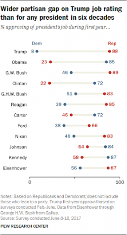
There was a wider partisan gap on Trump’s job rating than any president in the past six decades (solid approval rating data doesn’t go past Eisenhower). The historic partisan gap in Trump’s job ratings was in large part because of his unusually low ratings among Democrats, with only 8% of Democrats approving, giving him the lowest approval rating from the opposing party of any president in recent history. However, even before Trump took office, there had been a downward trend in presidential approval ratings among members of the opposing party. The previous lows were during the presidencies of Bill Clinton, whose average rating among Republicans was just 22%, followed by Barack Obama with only 23% approval by Republicans. So, it is entirely possible that Trump’s divisive presidency was actually a symptom of the pre-existing trend of polarization and partisanship, rather than the cause. It is also important to remember that political polarization in Congress has started rising since the 1970s, long before Trump took office, showing that this issue is much greater than just him.
The lack of a common enemy could be another possible reason for the expanding political divide. The low political polarization from 1945 to 1991 could have been in large part due to common enemies between Democrats and Republicans. In 1945, the U.S. had just come out of the Second World War, an event famous for uniting the American people. During the Cold War (1945-1991), there was still a common enemy: the Communists. After the Cold War ended in 1991, and that threat disappeared, there was a sharp increase of polarization in the House. Nowadays, there isn’t really a common threat that can unite the Congress and the American people. While it is true that the 9/11 attacks rallied bipartisan support behind President George W. Bush, this only lasted for a year or two, and completely dissolved with the 2003 invasion of Iraq, which once again divided the nation.
Lastly, when talking about increased partisanship today, we are comparing it to the recent past, as in years after 1945. We look at these graphs and see how rarely the two political parties agree on issues today compared to the 1950s and 1960s. But during this era, the political divide in the U.S. wasn’t entirely between parties, but by region. For example, after breaking down Congressional support for the Civil Rights Act of 1964, 96% of northern Democrats supported the bill, but just 7% of southern Democrats supported it. 84% of northern Republicans gave support, but no southern Republicans (0%) did. The issue of civil rights, along with other issues of the 1950s and 1960s, were fought between regions, not parties. Even though the country was still very politically divided, it isn’t really reflected in these graphs, since it wasn’t between party lines. So maybe the United States was also polarized during that era, just in a different way.
The main point here is that it is entirely possible that the United States has been politically polarized for a majority of its history, but the period from 1945 to 1980 was just a special time when polarization between parties was low. The high polarization and partisanship we see today may seem out of the ordinary when compared to the recent past, but when put into the perspective of the entire nation’s history, this could just be the country returning to ‘normal’ politics. If we go back to the graph of polarization between parties in Congress by the APSA, we can see that the politics of 1878 to 1920 were almost as polarized as nowadays.

Unfortunately any political data prior to the 1880s is either unreliable or simply nonexistent, so we can’t directly compare the politics of today to the entire nation’s history.
The future of American politics is next to impossible to predict, but it is incredibly unlikely that political polarization will continue at its current trend. This trend is simply unsustainable. Instead, political polarization and partisanship will probably stop growing but remain high for the near future, at levels similar to the decades before 1920.